

I think you'll agree, it's really hard to qualify leads on your website.
Or is it?
As it turns out you can dramatically increase lead quality by adding one simple page to your website. Most businesses miss opportunities because they don't have a Thank You Page or a strategy for their page. One of the most overlooked inbound lead nurturing components is your thank you page.
What is a Thank You Page?
A thank you page is the page your visitors, leads, and customers see right after filling out and submitting a form on a landing page/web page. Think of it as the last step in your conversion process.
In this post, I'm going to pick apart some of the best examples of Thank You pages on the web, show you reasons why you need them, best ways to create them and give you actionable takeaways you can use today to skyrocket engagement, boost your sales and convert your users into buyers.
First...
How Do I Write a Good Thank You Page?What to Keep in Mind When Creating Your Next Page...
- Message - Confirm the message and let them know there is a human on the other side. Tell them what they are getting, tell them the value of what they are receiving and tell them Thank You for "Downloading", "Discovering", " Supercharging Their Brain" or whatever CTA you created to make your user feel good when they hit that submit button.
- Give them the Offer. It can be in the form of eBooks, white papers, case studies, videos, etc. Deliver the promised content offer or set the expectations as to when they will receive the offer. Don't leave them guessing. Set expectations.
- Display your site's navigation menu. Any time you can let your users get back to your website is a good thing! Don't be shy. Put your Nav menu on your thank you page.
- Provide additional content. You can link to relevant content on your blog. It must be of interest to them. Adding links to your best content turns your Thank You page into an insightful resource that warms up your new users. And this in turn will help them make a buying decision later (…and you don't look spammy or come off sales-y).
- Move your leads further along in their journey and add an extra CTA. As long as it is a logical next step and complements the asset you just delivered to them.
- Include your social options. No better way to connect with your leads than social media.
- Because your stuff is so good, give your new lead an opportunity to share the offer. Make it easy for them with your social icons boldly displayed.
- If you have a second CTA that has a form. Remember your form length "mirrors the value of the offer". Don't overdo it.
But it doesn't stop there...
In a nutshell, your visitor came to your site, clicked on a CTA, filled out a form, and should receive your thank you page. Your TY page ends the conversion process.
Your thank you page will be successful if you provide additional educational content and guide your leads through their journey. Give your leads every opportunity to self educate and look around after they converted (like displaying your site's navigation menu) and they will love you for it.
Moving on to the goods...
Let's take a look at how this works in action with a case study (not theory, but hard cold numbers):
[TY Page Case Study] Why YOU Absolutely Need A Perfectly Optimized Thank You Page
According to research from Vorsight, at any given time, only 3% of your market is actively buying. 56% of your market is NOT ready, 40% are poised to begin. You have to feed them more information to get to know and trust you.
I think we covered that point enough, ad nauseam.
Let's take a look at this case study done by digitalSRC with some real numbers. It was done a few years back but still stands the test of time.
If this doesn't open your eyes, nothing will...
Thank You Page 1
Thank You Page 2
Thank You Page 3
hmmm which one do you think performed the best?
Category breakdown:
- worst performing TY page design
- TY page design with moderate traction
- TY page design with the highest level of user engagement.
You'd be right if you said Thank You Page 3 was the best performing.
And interestingly enough the average time spent on each page was:
thank you page 1 - 00:00:16
thank you page 2 - 00:00:44
thank you page 3 - 00:03:02
Let's dive into more lucrative and successful thank you pages that will increase your sales and build brand awareness.
13 Thank You Page Examples That'll Show You How to Get It Done and Have You Wondering Why You Haven't Been Doing It All Along
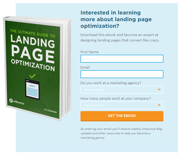
1. Unbounce
When it comes to lead generation, Unbounce is considered one of the best. So as you can imagine, we were intrigued to find out what type of strategy they used for their thank you pages.
So you can see the process, here's a recent version of one of their landing pages which takes you to their thank you page:
Thank you page: Download the Ebook Here (PDF)
"Thanks for downloading - now put it to good use"
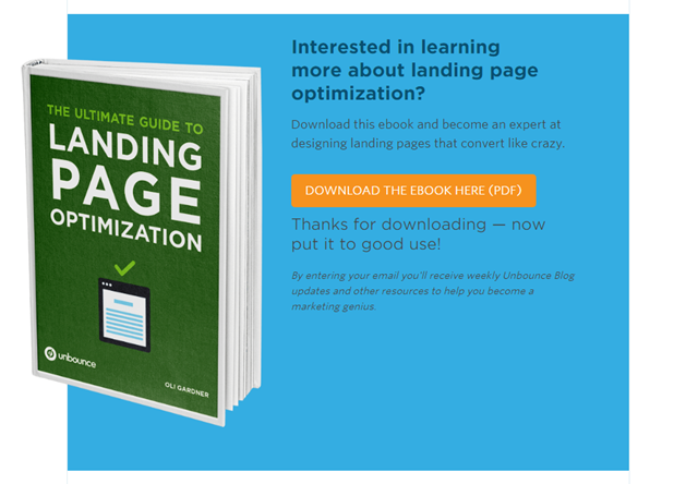
Unbounce's addition of the visual is perfect. You know exactly what you're going to get with their ultimate guide.
But wait there's more...
If you look right under the CTA, you'll not only receive the eBook but weekly blog updates and other resources to help you become a marketing genius. (pretty smart, huh?)
Also here's where their marketing savvy kicks up a level. Their offer was a 57 page PDF that included the landing page process, examples, etc.
Example of 1 of the 57 pages...

Look what they added at the end of every page - a link to their website and social sharing buttons. Two elements your thank you pages should have.
2. Intechnic
What can I say! Intechnic is a great example of a fully optimized Thank You page. Nothing is missing...
- States the asset we are getting "Simple SEO Strategies that Will Always Work"
- Video on page - using video is a great concept to "sell" without really selling your thank you page. It helps boost your conversion rates.
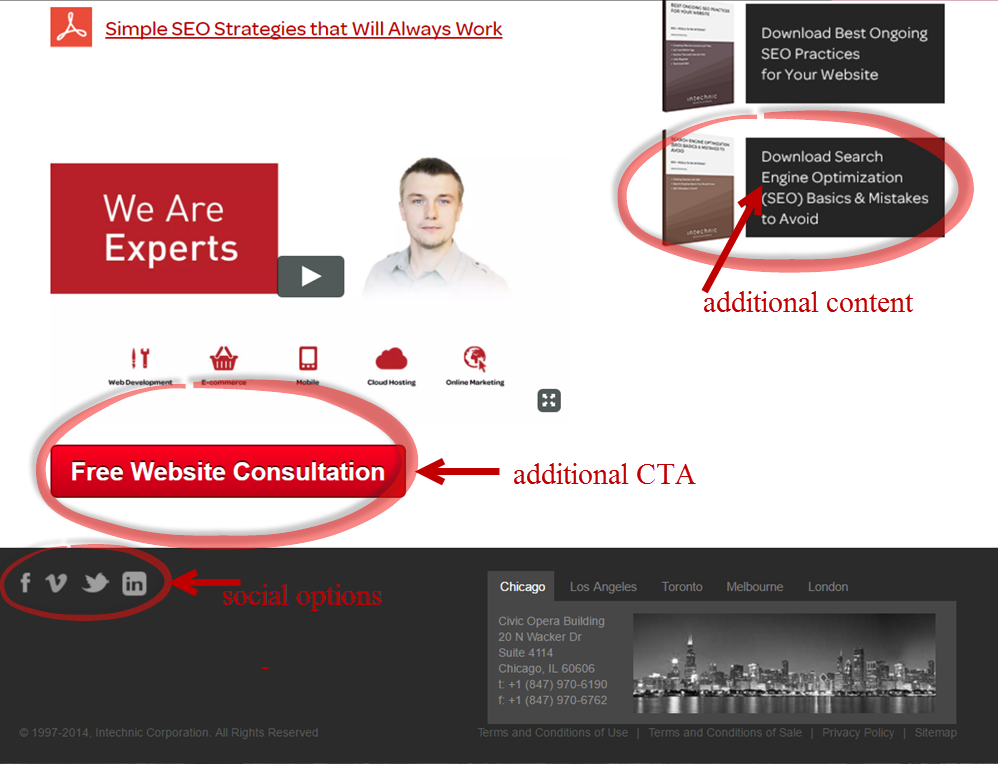
- Additional Call-to-Action
- Additional relevant content - Point them in the right direction where they can continue to read up on the subject (in this case SEO) because you know they already are interested in it!
- social options to connect with them
- nav menu - Lets your user continue to check YOU out.
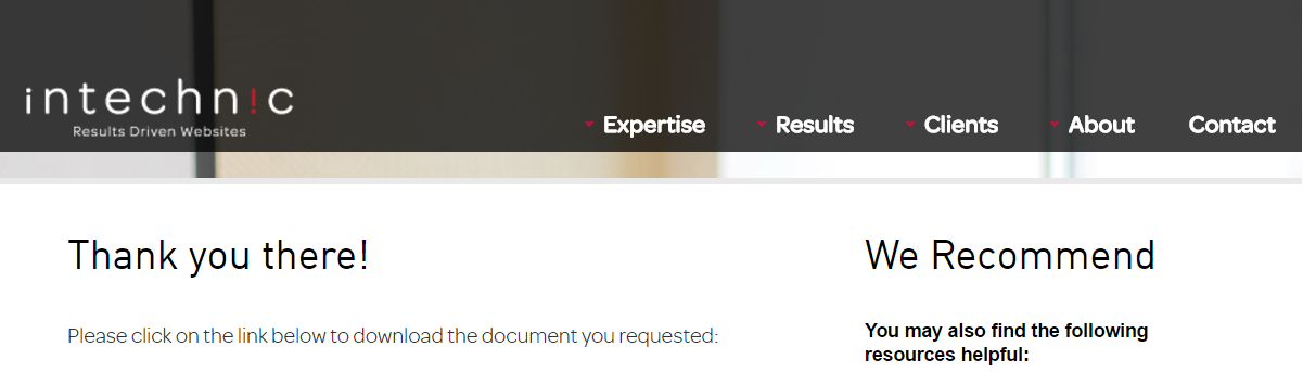
We would be remiss if they didn't get a "thumbs up" 
3. HubSpot
HubSpot does a great job of using their thank you pages. They provide the option to download the file as well as share with your social connections.
HubSpot chose to include a secondary offer to get free marketing advice. Even better, they personalize the message to create more interest in the offer. They also include their phone number to make it easy to reach out and talk to a representative now. This could be a great way to generate sales-qualified leads faster.
In case you're wondering what a SQL is...
It is a marketing-qualified lead that your sales team has determined to be worthy of a direct follow-up after a thorough examination. Keeps your marketing and sales teams on the same page in terms of what is to be considered a qualified lead.
Thank you pages are that place you qualify your lead and get more data intelligence to use for future marketing and sales endeavors.
Now back to breaking down the HubSpot Thank you page...
You'll see below their secondary offer to "Get Your Free Assessment" may be considered too aggressive by some inbound experts. Since your lead just downloaded an educational Ebook (aligned with the awareness stage of the buying process), they are gathering information and probably not ready to talk to a sales representative.
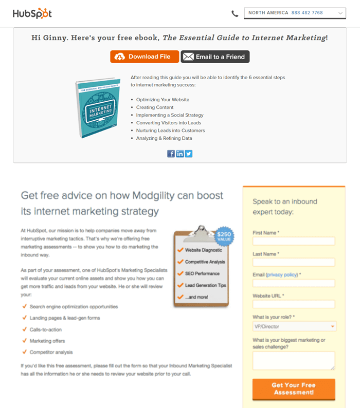
HubSpot took their own advice and added an additional image on their Thank You page. Placing visual emphasis on the value will help explain the offer clearly. Without question, your leads will identify the 6 essential steps they need for their marketing success. Confirms the "message".
Also, love the "email to a friend" enhancing the opportunity to share the offer.
4. Conversion XL
Conversion XL provides direct steps of what they want their users to do next:
Download "Master the Essentials of CRO" ebook here. (keyword in the title ;) )
Your leads are then given a clear, action-oriented objective of what is the next step in their journey:
"Enroll in Conversion XL Institute"
In addition, they display the site's navigation menu to give their leads every opportunity to browse around the website for more information even after they converted.
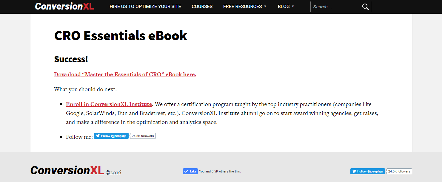
And they added a Facebook "Like" button and follow on Twitter.
Don't you love it when you connect with your leads on social media?
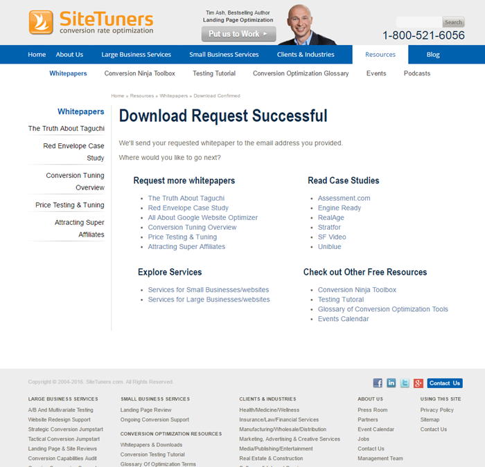
5. Site Tuners
The conversion rate optimization (CRO) specialists "Site Tuners" utilize their thank you page to help you navigate their site. Specifically, they provide the opportunity to request more whitepapers, case studies, services, and other free resources.
They provide plenty of options to take the next step. However, there's a ton of information to absorb which may cause information overload and lead new prospects to get confused and bounce.
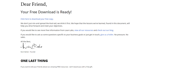
We wanted to see some more info for Site Tuners so we entered our email again and downloaded a whitepaper. Here's the email "thank you"...
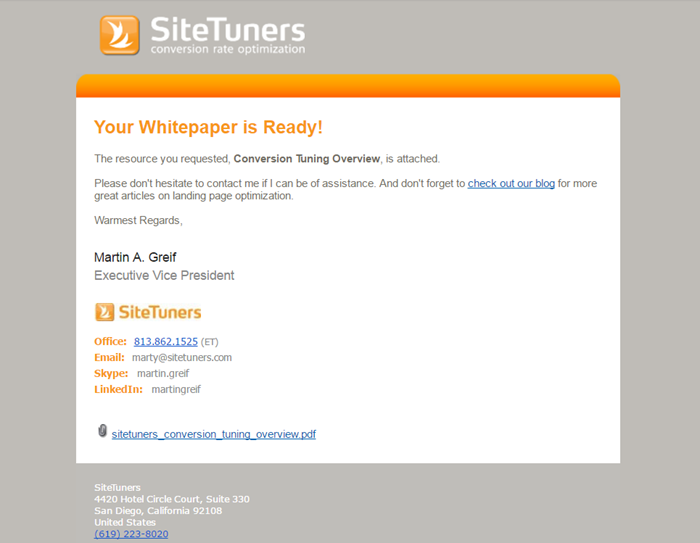
SiteTuners always gives you the opportunity to gather more information. They direct you back to their blog as well as their phone number, email, skype, and LinkedIn profile. The commonality on their pages is to provide additional content which they do very well by directing you back to its blog.
Attaching the whitepaper in a PDF form is their way of delivering the promised content offer.
6. Salesforce
A recent thank you page from Salesforce incorporates some best practices for a dynamic page.
You'll see they personalize the page to the lead (in this case ... me). Using a name will always give your prospect a warm feeling.
The added image pops and lets your lead know visually what they are receiving. You'll also see on the right related sources or another offer that might be of interest to them. They are thinking of their buyer and how they can help move them through their buyer's journey.
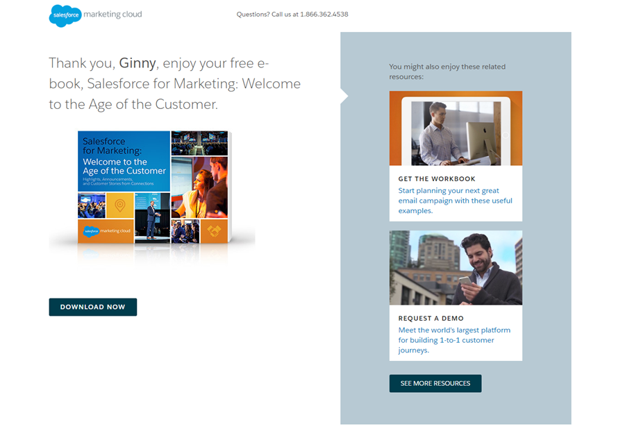
Although not shown here, they did have some social options listed on the bottom. We would have to give them a huge thumbs up ![]() for covering all the bases.
for covering all the bases.
7. AWeber
AWeber is an email marketing platform that allows small companies to create and send emails.
Looking for more information on email marketing, I stumbled upon, "Should You Use Emojis in Your Subject Line?" They had an offer for "What to Write in Your Emails" guide with 45 free, fill-in-the-blank email copy templates.
Their thank you page definitely hit the mark of what a good TY page is all about.
A good thank you page should:
- thank the subscriber for signing up or welcome them
- provide instructions on what happens next.
AWeber says, Congrats! You're in! Welcome to the "What to Write Course".
They included a link to "Access the guide here now". And next steps.
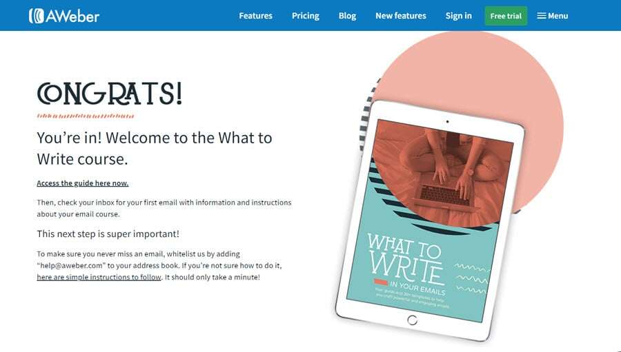
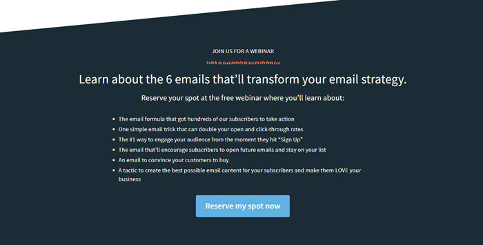
The second half of the email provided a way to get additional content. It included a relevant Call-to-Action for a webinar.
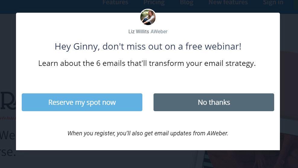
And AWeber took it a step further with a pop-up. As you can see they step up their game with personalization. Personalization is a powerful tool and it creates a more intimate experience for your visitors, leads, and customers.
8. Marketo
We wanted to get our hands on "The Definitive Guide to Marketing Metrics & Analytics".
Once our information was submitted this is what the page looked like:
With one click "Download Guide", we could download their 70 page whitepaper. By the way, the guide had social options displayed on the bottom of every page to share with our respective networks.
But the best was...
once Marketo had our information we could download other whitepapers that met our needs. Their navigation menu was in plain sight to continue to click on to gather more information.
Talk about delivering Value...
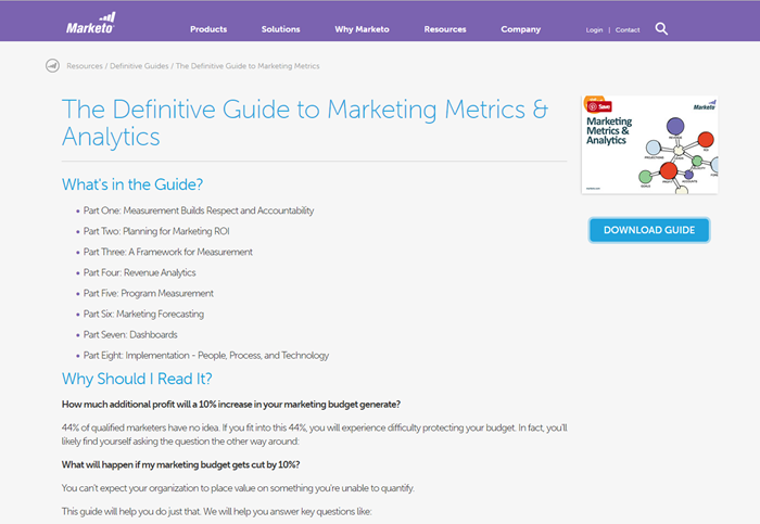
I appreciate how they laid out exactly what's in the guide and WHY I should read it.
9. Impact
Impact immediately sends you to the Download Now page. Their Ebook which is 31 pages includes social share buttons Facebook, Twitter, and LinkedIn. And as you can see it's on their Thank you page. And Email to your friend!
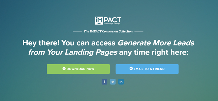
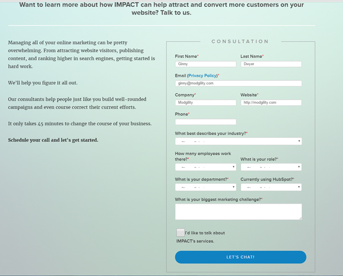
Impact offers a secondary CTA. You can chat with them.
Keep in mind your lead already made a micro commitment by exchanging their email information for access to the Ebook or whitepaper. They are now less apprehensive to further exchange more detailed information about themselves.
A secondary form or another Call-to-Action may not be as stressful to them. It should always be a related offer to help them discover the next step in their buying decision.
The choice is yours whether to add the second CTA but make sure it's a good one!
10. Leadpages
Clearly, we've seen easy and complicated examples.
Leadpages was one of the first landing page builders I used. It integrated with my autoresponder easily and delivered the asset with no extra work on my part. Which is code for, "no coding needed".
You'll see this particular page is grateful we hit the submit button and asked for the eBook. No doubt a message of thanks confirms we did something right on our end and somewhat lets me know there is a human on the other side.
Leadpages gives you the option to claim a free spot on their upcoming webinar to help you generate more leads and sales. They use scarcity in their marketing with only 500 spots available and the count down timer.
The persuasion technique has been around for a long time. Simply because it works. But be honest when implementing the tactic.
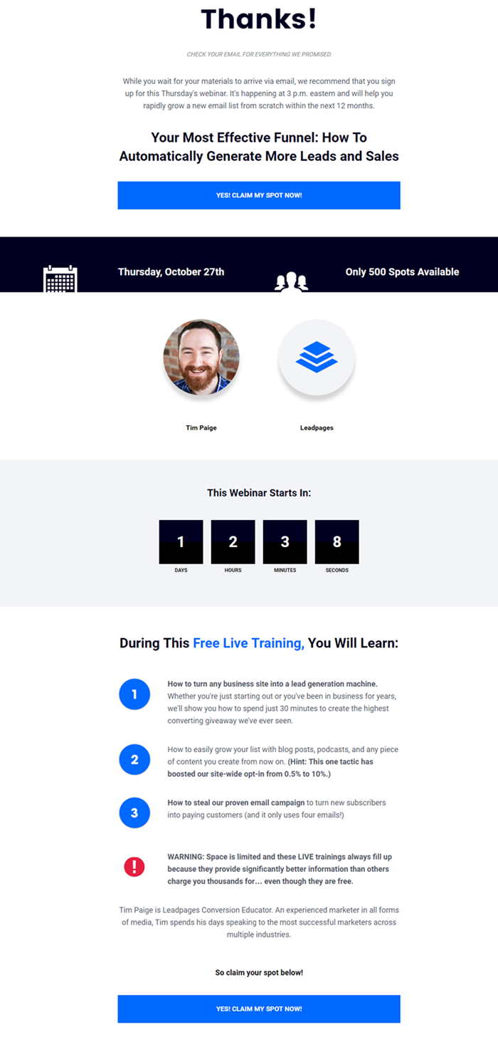
p.s. It wouldn't hurt to add social share buttons to encourage visitors to spread the word!
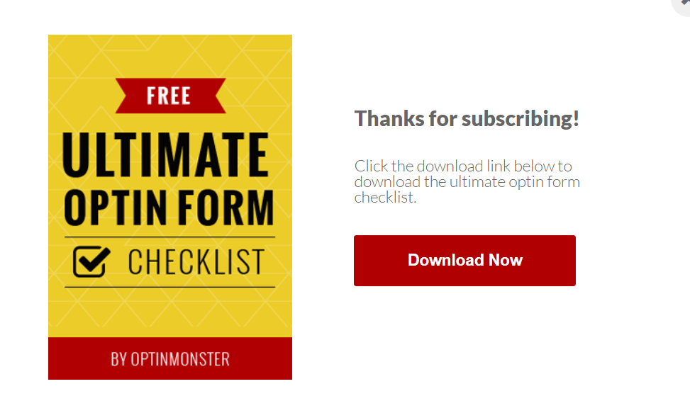
11. Optin Monster
If you need a quick Thank you page up and running, Optin Monster shows you how to do it.
Though basic ... they actually have a thank you page! If you're one that still uses just a quick message -Thanks for subscribing, you need to come out of the dark ages.
Refer to the case study above where that Thank you page failed miserably compared to their others with 100% exit and no more than 16 seconds on the page.
Compared to other TY pages I think if they added a few more best practices their TY page would get more engagement and boost sales.
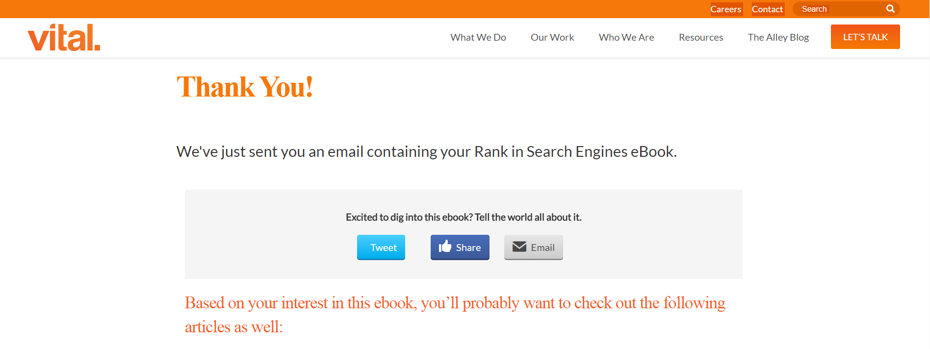
12. Vital
If you ponder any thank you pages...
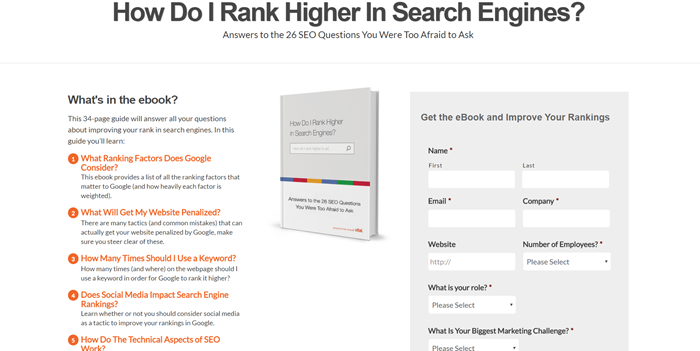
You NEED to study this one. Vital has a strategy that is second to none. They have optimized every section on the page and more.
Take a look:
- confirmed message with the name of the asset "Rank in Search Engines eBook"
- sent the offer instantaneously (set expectations)
- based on my interest, not their's... displayed related content I could get my hungry hands-on
- added a secondary CTA...more on that in a sec
- social options to connect with them
- navigation menu displayed
- right smack in the middle SHARE buttons to tell the world all about the eBook...let's talk about that below...
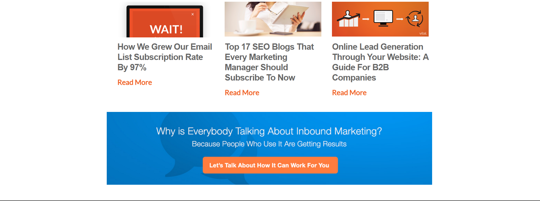
- right smack in the middle SHARE buttons
Here's their Tweet ready for anyone to share:

Guess where the URL goes>>>back to their landing page.
Let the process begin again. Rinse and Repeat!
As promised let's take a look at the secondary CTA displayed at the button of the thank you page:
Is this a good secondary Call-to-Action?
If you wanted to know how to rank in the search engines, you probably want to know about Inbound Marketing. They go hand in hand. It's what ties the digital disciplines altogether.
So I'd say a big fat yes. and they get the ![]()
13. Lean Labs
Without repeating myself again Lean Labs hits all the hot spots.
Scroll to the top and review :
What You Should Keep in Mind When Creating Your Next Page and you'll agree they are spot on.
I only see one thing missing.
Can you guess what it is?
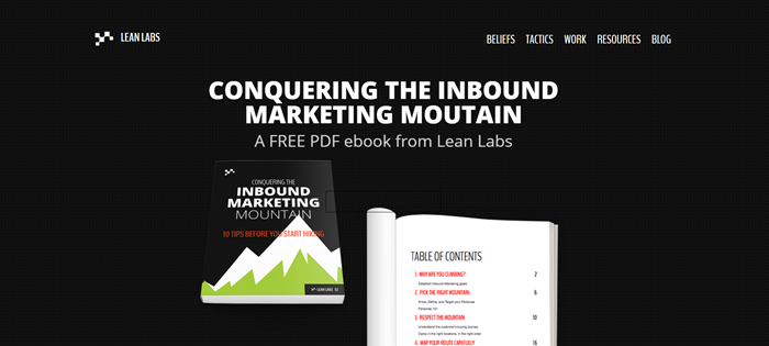

if you thought social...
you'd be right!
So Did You See It?
The examples moved you further into the buyer's journey with more value and educational content.
There are so many more I'd love to show you! But you gotta go create your awesome Thank You page.
Once you get creating...
Remember the Thank You Page Best Practices:
- Deliver promised content offer and set expectations
- Display your site's navigation menu
- Provide additional content
- Move your leads further into the buyer's journey by nurturing them
- Include your social options
Now It's Your Turn...
Get to work right now on your next Thank you page. Build trust with your new lead. Educate and Guide.
Thank You Page Key Takeaway
Thank you pages are useful to move your leads further into the buyer's journey, extend your social media reach and provide additional content and value to your new lead.
You know what they're not useful for...
Closing those same leads that just signed up for your offer to customers.
Not yet at least!
Back to you...
What seems to be working for you? What doesn't?
Do you have a thank you page example you want to share?
Show us in the comments below.
Curious about inbound for your business? Check us out!