Share this
by Hunter Liptrap on Jan 7, 2016

Your homepage should be designed professionally with the goal of leading visitors through your sales funnel and the buyers journey. However, this is rarely the case.
According to Eisenburg Holdings companies spend, on average, $92 to bring visitors to their site for every $1 spent on converting them into customers.
Let's take a look at 8 keys to homepage design, it won't even require you to increase your conversion budget by 9100%.
These are actionable tips that you can apply right now, so let's get started.
1. Give Your Blog Priority
Companies that actively blog command 126 percent more growth in leads than businesses which do not publish original content. An active blog is a signal to search engines that your website is active, providing detailed answers, establishing authority, and is active on social media.
Not to mention it gives your website more pages to be crawled.
Not only is blogging one of the 3 major sources that drive traffic to websites, the other two being search engines and social media, but it's what helps covert traffic into leads.
Just like every blog post you write is another indexed page, each post is a new opportunity to generate new leads. As long as you add a lead-generating call-to-action to every blog post, you will be giving your visitors another way to convert into a lead.
Often, these calls-to-action lead to things like free ebooks, free whitepapers, free fact sheets, free webinars, free trials ... basically, any content asset for which someone would be willing to exchange their information. To be super clear for anyone unfamiliar with how traffic-to-lead conversions work, it's as simple as this:
- Visitor comes to website
- Visitor sees call-to-action for a free offer
- Visitor clicks call-to-action and gets to a landing page, which contains a form for them to fill in with their information
- Visitor fills out form, submits information, and receives the free offer
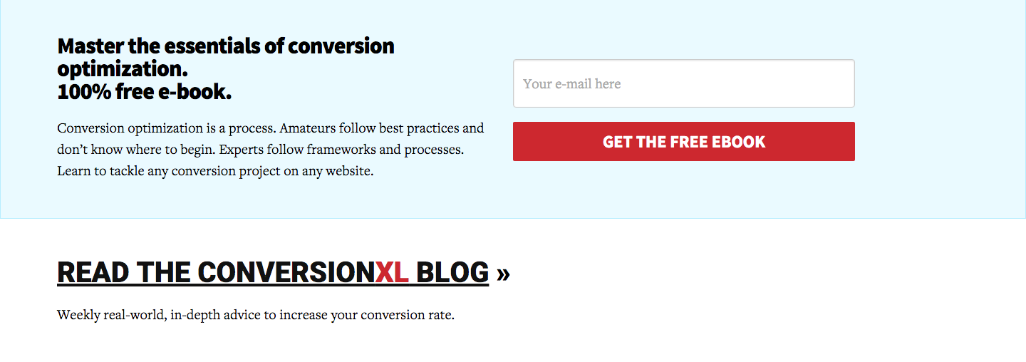
Now that you see how featuring your blog can help you increase conversion, don't hide your blog link on your homepage. That means don't bury it in the footer or hide it from your navigation.
You may even want to include a section to drive traffic to your blog. Take a look at how ConversionXL added a link to increase traffic to their blog.
2. Keep Company News off Your Homepage
Keeping your audience informed about your business will increase trust and building trust is a critical part of converting a visitor into a lead. Your company news can be used to build trust, but it is very "me" centric. While a blog is used to educate a visitor by answering their questions and driving traffic to your website, company news rarely answers a question that a visitor has.
That's why news belongs in a separate blog category or it's own news feed, not on the home page.
When someone on your homepage visits your blog they are taking a step towards converting because you are helping them answer questions that they have about your industry, your company, and their other interests. However, when someone on your homepage leaves to view your company news you are rarely moving them closer to conversion. Instead, you are merely providing a distraction for visitors.
If someone clicks to read more about a news story, or worse is taken away from your website, then you are giving them a path away from what you really want them to do. Convert.
3. Create a Clear Call to Action
Only 47% of websites display a clear call to action that takes visitors 3 seconds or less to find. That means almost half of the websites leave visitors wondering "What am I supposed to do here?".
Creating too many options can lead to decision overload and cause a visitor to bounce.
So how do you know what your call to action should be? Create buyer personas to know what your customers actually want.
By knowing what your customers want you can add the proper language, offers, and call to actions to turn visitors into customers on your homepage without having too many options.
You can have multiple locations for a call to action, but they should all lead to the same place or serve the same purpose.
Finally, make sure it's clear what will happen when a visitor clicks your call to action.

This is the feature call to action button on Unbounce's homepage. Of course there is a header and sub headline leading up to this call to action, but even without them you know what's going to happen when you click that button.
4. Avoid Adding Clutter
If doesn't need to be there, don't add it.
Stuff, stuff, and more stuff isn't the answer to good homepage design.
When creating your homepage you aren't throwing stuff against the wall to see what sticks. Whatever is on your homepage should be there for a reason.
That doesn't mean your homepage has to be short or empty. When it comes to copywriting, different subjects often require different writing techniques and styles. If you need to explain a complex concept or idea that isn't part of the everyday conversation, then explain it in detail.
The most important thing is that visitors can recognize and understand what you do.
That said, most visitors won't read all your copy no matter what you do. Web page visitors are prone to scanning pages and spending most of their time above the fold, what they can see on their screen without scrolling down, looking at images, and reading sub-headlines.
So use this information to your advantage. Keep your most important information above the fold and create compelling sub-headlines that engage visitor interest and help point them down the path to conversion.
5. Make Sure Your Page Loads Quickly
In this age of digital information, users want their information quickly. Google, in the past, has said PageSpeed is a ranking factor. While, it may not be the most important factor you should still understand that page speed is part of the user experience.
A page that doesn't load quickly gives the visitor a reason to leave. Check out these stats when it comes to page load speeds:
- 40% of people will abandon a web page if it takes more than 3 seconds to load. (Source: Econsultancy)
- The change in a website bounce rate spikes to 100% when a page takes 4 seconds to load. (Source: Mobile Joomla)
- Bounce rate jumps up to 150% if a page takes 8 seconds or more to load. (Source: Mobile Joomla)
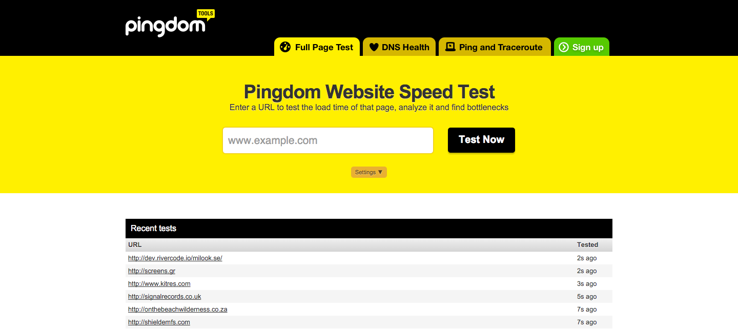
So, then the question is raised, How do you check your site speed?
There are plenty of sites that will check it for you, but the one we prefer to use is pingdom.
If your website feels slow check these common problems that tend to weigh down a websites loading time.
- Ad network code - Display ads on your website can lead to a slower load time, because most of the ads rely on JavaScript based code.
- Analytics Tags - Of course analytics are important, like Google Analytics for instance, but the more analytics codes you have on your website the slower it will load. You should try to stay with fewer publishers when it comes to analytics and tracking code.
- High Code to Text Ratio - The more complex your website is, in terms of using tables, in-line styles, and fancy features the more HTML and CSS code you are using on your page. That means that more information has to be transferred to the user than you might think, which also slows down page speed.
- Public Networks for Private Data Transfer - One of the first things many publishers do when they need to start to scale is to split their web and database servers. But many don't connect the two using a private network, creating a huge bottleneck and point of failure that can easily impact website performance.
- Unoptimized / Uncompressed images - Big beautiful images are a web design trend, but they can also be detrimental to your page load speed. Use a web tool like compressnow to shrink image sizes. Even if you compress your images by 5-10% you can see a really big difference.
6. Audio and Video Should be Click to Play
A corporate video is a great way to tell your brand's story, there's no doubt about that.
However, that doesn't mean everyone wants to hear it the moment they load up your homepage.
Have you ever been to a site that starts playing sounds out of nowhere? It's incredibly annoying. You are making the choice for the visitor and that's not what you want to do. You want the visitor to travel through your website on their own, with the right direction from you.
If you are going to feature a video or audio clip on your homepage, make sure that it is click to play.
That means in order for a visitor to view or listen to your story they have to want to click it. Make it clear that your piece of media is clickable by adding a play button, putting it in a prominent location and adding text in your headline or sub headline that makes it clear that you want them to click to play your video or audio piece.
Looking for an example? Check out this page from intuit:
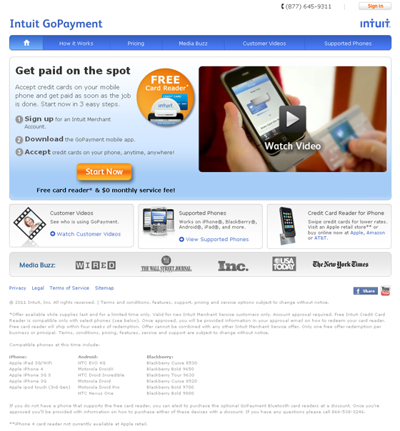
Technically this is a landing page of theirs, however, they didn't design it like one. The navigation is still there and there's still a full footer.
Intuit's feature section with the video is great. It would be hard to leave this page without clicking to watch their video. It's in a prominent location, has a play button, and the words "watch video" over the video.
7. Create a Clear Navigation
If your user doesn't know how to work your navigation, then it is going to kill your conversions.
Typically navigation is found across the top or to the left side of a website. Stick to this. Deviating from standard locations can cause a user to get lost and ultimately leave your website without converting.
Furthermore try to avoid dropdown menus. A lot of big name retailers can get away with this because they are known and trusted entities. However, if you are not a big time retailer it can often be difficult to navigate your website.
This can be a challenge because it's on you to simplify your website in a way that makes sense for the user.
"If I had more time, I would have written a shorter letter." - Blaise Pascal
You could also go with Keep it Simple Stupid, if you'd like.
The short term memory can hold only seven items. To make your website as simple as possible, limit your menu to seven items or fewer.
Many websites try to give their users as many options as possible, but you may end up only creating something that is immensely confusing.
Take a look at Unbounce's homepage:
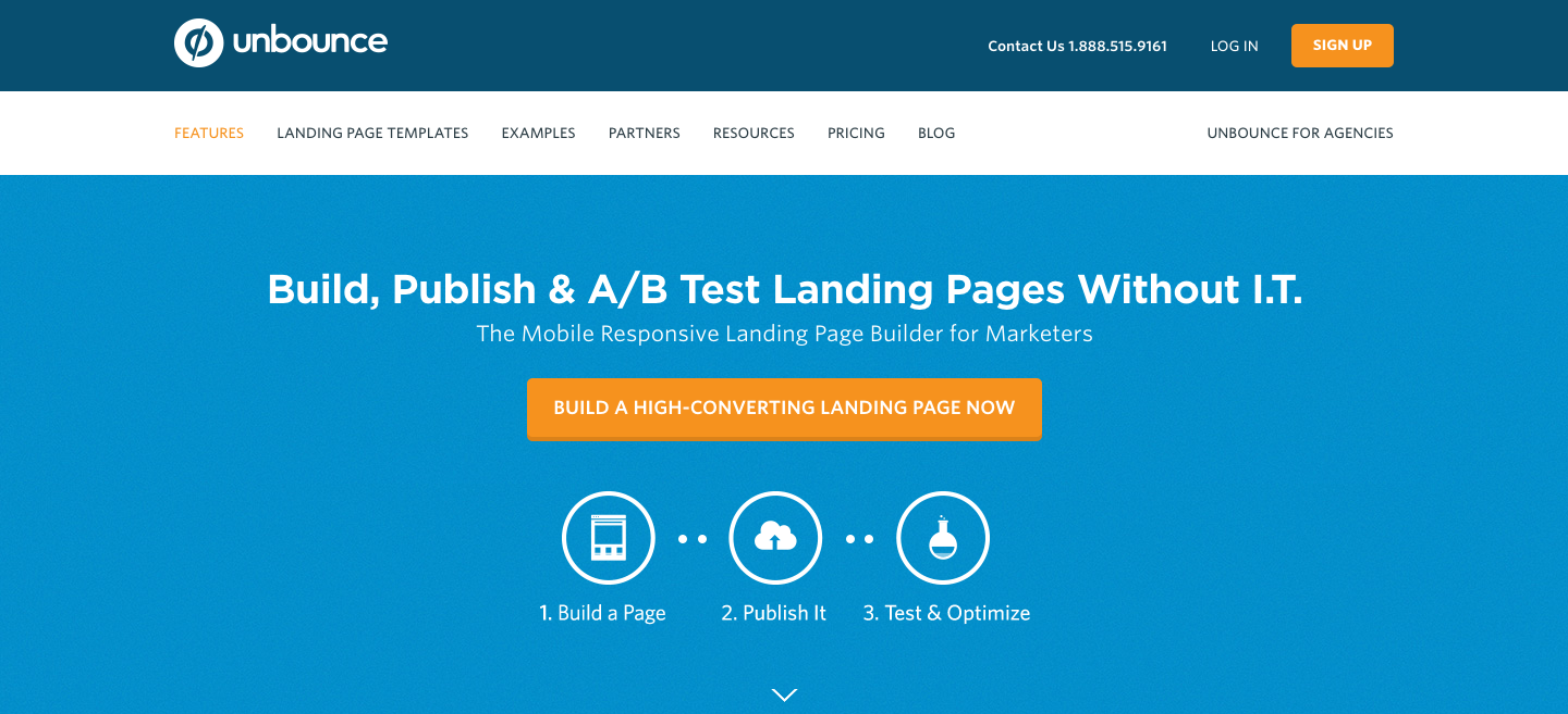
If a brand built on the idea of conversion optimization has a simple navigation, you may want to consider doing the same. Granted they have more than 7 links, they have 10 if you include the two links on the top, but it's still a simple navigation structure and doesn't feature a dropdown.
In short, the less menu items you have the more prominent they are. Therefore, you can direct the user where you want them to go and increase conversions.
8. Improve Readability
Lack of readability can be caused by multiple factors.
First of which is a wall of text. Long paragraphs are intimidating and hard to read on a computer screen and will often result in the paragraph not being read or the visitor leaving entirely.
Here's the definition and an example from Urban Dictionary

Instead of writing like this, write like you talk. Obviously use proper grammar and avoid slang, but your paragraphs should be shorter, easier to read, and easier to understand.
A typical homepage avoids long form content all together. A good homepage design will be broken up in to sections either based on product, function, or feature that the visitor may be interested in. Doing this makes it easy for a visitor to navigate their way through your homepage while still understanding what you are about.
Plenty of websites do this very well. You can take a look at Thrive Themes.
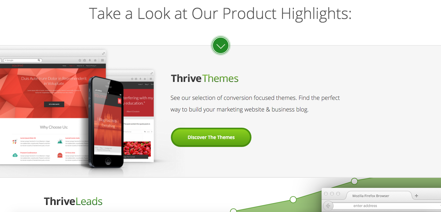
They feature multiple products on their homepage, each in their own section with a snippet of text and a call-to-action asking you to learn more.
Other tips you can use to make your homepage more readable are to use:
- sub headlines
- bullet points
- relevant imagery
These will help you convey your story in a way that is easy to digest and interesting.
Conclusion
Crafting the perfect homepage for your business may not be the easiest task, but it is essential in converting visitors into leads. The most difficult task can be determining what visitors are really there for. That's why you should be sure to create buyer personas and understand how your ideal customers think.
By knowing who is on your website and what information they are looking for, you will be able to create a good homepage design that will increase your conversion rate.
Want more web design expertise for your business? Check us out!
No Comments Yet
Let us know what you think